Case Study:
Customer Loyalty App
for Existing Brand
Role
UX Designer, UX Researcher, and Content Designer/
Copywriter
Duration
7 weeks
April - June 2022
Deliverables
User Research, Personas, Competitive Analysis, Storyboards, Wireframes, Mockups, Prototypes, Usability Studies
Tools
Figma, Whimsical, Google Suite, Google’s Material Design System, brand website
Overview
I designed a mobile Customer Loyalty app for the existing brand, Stoney Clover Lane, that allows users to rise through a tiered system of exclusive rewards and benefits. Simpler access to Customer Support is integrated within the app.
The majority of Stoney Clover Lane customers browse and shop via mobile device, however, there is no existing mobile app to reach this specific market. No Customer Loyalty program exists for customers, and users report distaste with the high costs of shipping, as well as the high costs of products in general. Users also report challenges in obtaining Customer Support.
Problem
This mobile Customer Loyalty app will let users earn points for every dollar they spend, which will affect users who shop frequently or purchase more expensive items by allowing them to save money. The integrated Customer Support feature will allow users to connect/communicate more easily with the company and increase user satisfaction.
Solution
Stage 1: Empathize
Background Research
• Stoney Clover Lane is a lifestyle brand that was established by Kendall and Libby Glazer in 2009
• The brand is known for its brightly colored bags and organizational pouches
• Rose to prominence over the course of the pandemic due to popular collaborations with brands such as Mattel (Sanrio, Barbie, American Girl), Love Shack Fancy, Lele Sadoughi, Disney (Mickey & Friends, Princesses, Star Wars), and a diffusion line for Target
• Their target demographic seems to be individuals who appreciate luxury fashion/accessories brands, but are looking for more affordable options for travel and heavy, daily use
• User Research shows that customers’ median household income is around $100,000 annually
Understanding the Brand
User Research
Surveying Brand Customers
& Brand Website Users
Initial user research was conducted using a Google Form. The survey was administered to members of two Stoney Clover Lane-centric Facebook groups and there were 15 respondents total.
The participants were asked 8 questions (along with demographic questions):
About how often do you browse or shop using the SCL website on any device? (select the answer that is most accurate)
When you visit the SCL website to browse or "window shop," which device do you use most often?
When you make a PURCHASE on the SCL website, which device do you use most often?
Has the cost of shipping ever prevented you from making a purchase through the SCL website?
What makes the SCL brand special to you? Why are you attracted to the brand? Please explain.
What is your LEAST favorite part about the SCL website? Please explain.
Has your frustration with the SCL website ever prevented you from making a purchase?
How many SCL purchases do you make per month?
• 93% of users BROWSE primarily via mobile device, and 33% of users PURCHASE primarily via computer or tablet, presumably because they are customizing with the intricate and sensitive Customizer feature.
• 67% of users browse AND make purchases via mobile device.
• Users reported an affection for the brand due to its extensive opportunities for Customization and creativity, the colors/prints and collaborations, the quality and type of product, as well as the community of loyal customers who interact via social media
•33% of users surveyed were between the ages of 36-45. 53% of users surveyed were between the ages of 26-35. 13% of users surveyed were between the ages of 18-25.
• Median household income was approximately $100,000 annually
Findings
Stage 2: Define
User Pain Points
87% of surveyed users have forgone a purchase due to the high shipping cost. 27% of users reported issues with high costs in general.
To address this, a Customer Loyalty Program will be created.
High Cost
20% of surveyed users reported struggling to navigate the website. One user specifically mentioned the confusion associated with Sold Out items being viewable.
Design for a mobile app will be simplified and easy to navigate.
Poor Web Design
Users also reported frustration with Customer Support and the steps required to gain support.
A user-centric Customer Support feature will be created and integrated into the mobile app.
Customer Support
Personas
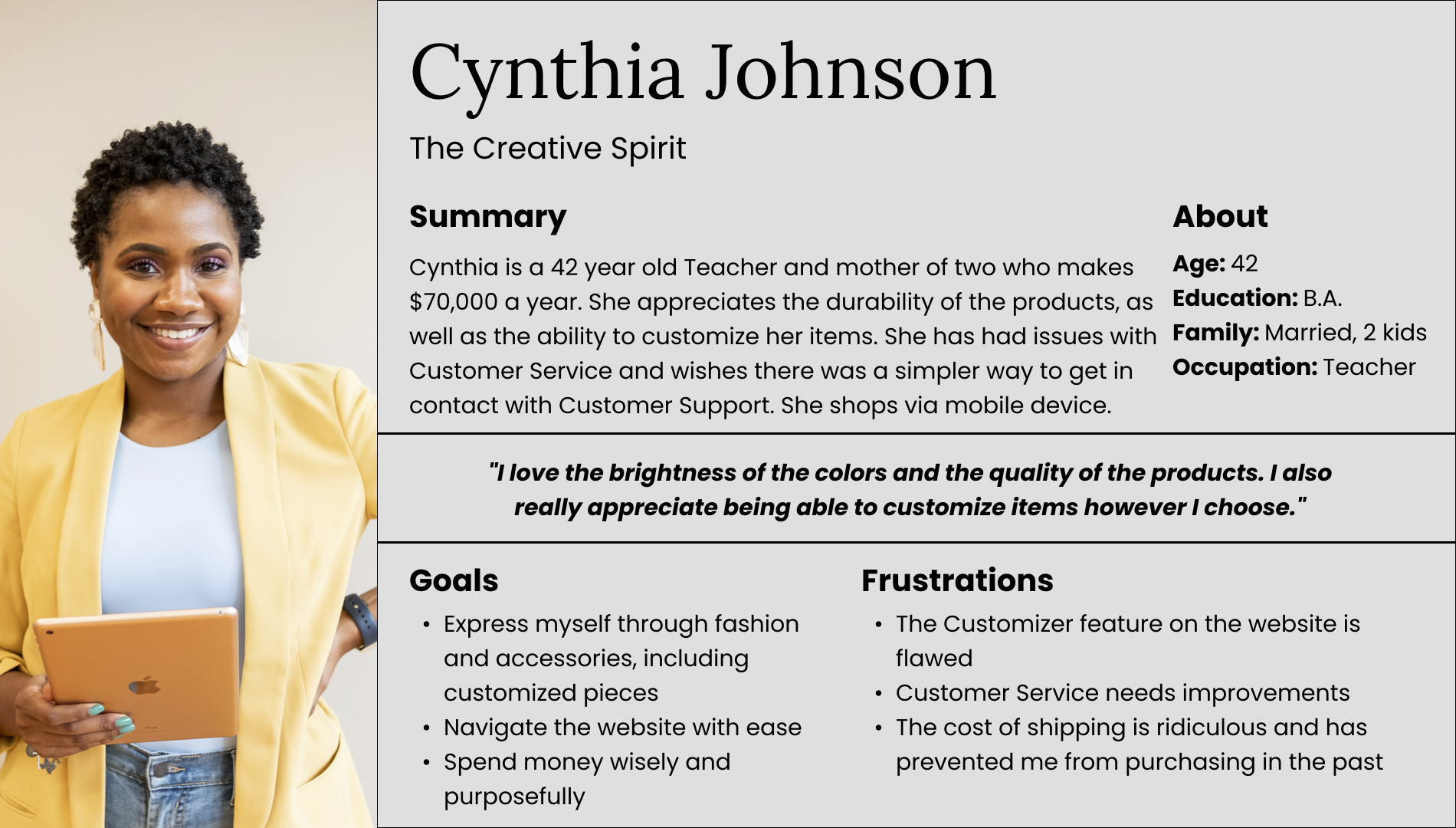
Based on initial user research, I created two personas:
1.) Monica DiLeonardi - “The Community Conversationalist and Saver”
2.) Cynthia Johnson - “The Creative Spirit”
These personas helped me put myself in the user’s position and understand their wants and needs. With that knowledge, I crafted a User Story for each persona.
User Story:
”As a 30 year old business woman trying to save for my future, I want access to discounted shopping so that I can save money whenever possible.”
User Story:
“As a busy teacher and mother of two, I want to navigate the website via mobile device with ease and gain simpler access to Customer Service so that my intricate Customizations are communicated clearly to the designers without error.”
User Research Conclusions
The number of pain points identified via a user survey are more extensive than I initially predicted. This indicates that my research survey was initially too broad and it is likely that more targeted information could have been acquired during 1:1 interviews.
Knowing this, my goal moving forward became to create a mobile Customer Loyalty App for the brand Stoney Clover Lane to address the 87% of users who have forgone a purchase due to the high cost of shipping. The Customer Loyalty App will target the 67% of users who browse AND make purchases via mobile device, as well as the 93% of users who BROWSE primarily via mobile device.
Next Steps:
User Journey Map
This user journey map based on one persona shows how the user would create an account and log in to the Stoney Clover Lane Customer Loyalty App. Considerations were made regarding potential issues encountered, as well as ways the app could be improved.
Main User Flow
I mapped out the main user flow within the substitute app, which helped me begin to think more broadly about the app/website’s Information Architecture.
Planning/Brainstorming
I began thinking about the Information Architecture of my app and created a list of Must Haves, Nice to Haves, and things to Add Later. This helped me prioritize my design goals.
Competitive Audit
I conducted a competitive audit of three direct and indirect competitors of Stoney Clover Lane, including Calpak Travel, Away Travel, and Girlfriend Collective. In doing so, I was able to compare the user experience of each competitor’s mobile website. Factors that were assessed range from product offerings and price points, to unique value propositions, user flow, and tone.
Notably, all three competitors had their own Rewards Programs in place, whereas Stoney Clover Lane did not.
Stage 3: Ideation
Storyboarding
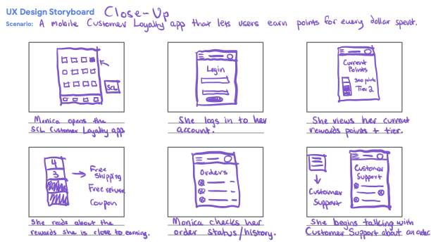
To gain insight into how users would navigate through the Customer Loyalty app and their user paths, I mapped out two storyboards, focusing both on the big picture, as well as the inner workings of the app itself.
Paper Wireframes
Based on user pain points from my initial research, as well as the results of my competitive audit, I began sketching out paper wireframes on my iPad of the Customer Loyalty App’s Home Page.
I quickly wrote down the elements I wanted the Home Page to have, then I began iterating on my designs. When I was finished, I took a moment to put a star by elements I wanted to recreate in my digital wireframe.
Digital Wireframes
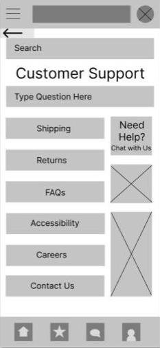
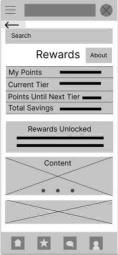
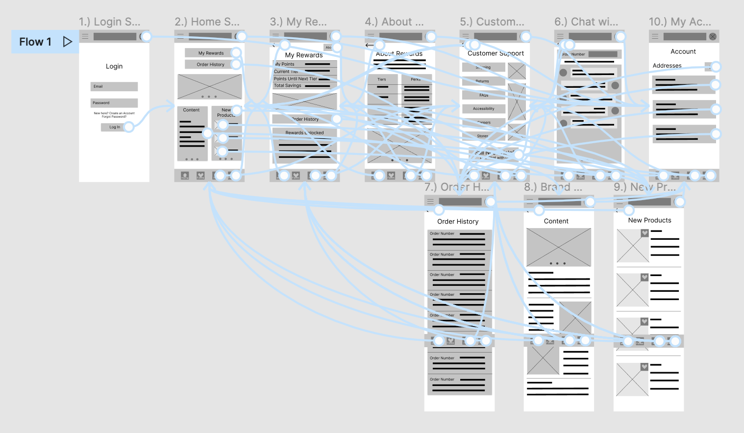
Once I sketched out paper wireframes for each screen, I began turning them into digital wireframes in Figma.
As I worked on my wireframes for the Customer Loyalty App, I kept in mind the importance of addressing the two main user pain points: high cost, as well as difficulty engaging with Customer Support.
*Please note that I had yet to learn about the importance of consistent placement across screens, standard icons, or grids.
• Customer Support via the app is a central location where users can get help, including by chatting directly with Customer Support
• Users can check their current rewards points and view their progress towards their next reward
• Users are also able to view exclusive brand content based on their rewards tier
Stage 4 & 5:
Prototype and Test
Lo-Fi Prototype in Figma
In my low fidelity prototype in Figma, users are able to navigate through multiple user flows, including logging in and checking their current Rewards points, as well as initiating a chat with Customer Support.
Please note that the lo-fi prototype linked here reflects the changes made following the first round of Usability Testing.
Usability Testing
Round 1 of Usability Testing was conducted remotely via a Google Meet moderated study on May 27-28, 2022. There were 5 participants, including one individual with red/green colorblindness, as well as an individual with ADHD. My research goals for this study were:
to determine if users can complete standard tasks within the lo-fi prototype
determine pain points and ways to improve the prototype
Usability Testing Round 1
1.) Add text along with the icons for ease of use
2.) “Need Help?” Chat button should be more centrally located
3.) A clearer phrase should be used to indicate User Rewards on the Home Page
Findings
I created the following Affinity Diagram based on the commentary and feedback collected during this round of Usability Testing. Based on the results of this usability study, I was able to organize their feedback into themes, and create insights for how to improve my prototype.
Affinity Diagram
Brand and UI Considerations
Before beginning my hi-fi mockups, I devoted time to thinking about the Stoney Clover Lane brand. As it is an existing brand, colors were lifted from the current website and styled elements were recreated/reinterpreted to the best of my ability.
Design System
Accessibility Considerations
Clear, standard icons were used along with matching text so that the mobile Customer Loyalty app would be compatible with a Screen Reader.
A grid was used to assure appropriate margins, meaning all items could be selected easily on a mobile device. All text is 16 px or larger. Negative space is utilized to allow the eye to rest.
The existing brand website does not use high-contrast colors, so outlines were added when possible to improve accessibility for those with color blindness or low vision, while still remaining true to the brand’s style.
Brand Consistency
Colors and typefaces were lifted from the current Stoney Clover Lane website (with the exception of an Adobe specific typeface, Quincy SF – Lora was used in place of this). All Stoney Clover Lane product images were lifted from their current brand website.
If working with the brand directly, I would be sure to follow their style guide precisely to maintain consistency with icons, colors, and typeface. I would also advocate for higher levels of color contrast to make the app more accessible.
Iterations
Changes After First Usability Test
During initial Usability Testing, most users had trouble understanding the iconography of the bottom navigation menu, and some users disliked the language regarding Rewards on the Home Page. There was also some confusion about the symbolism of the star icon. As a result, text was added to the bottom navigation menu, standard icons were utilized, and microcopy/organization was improved along with the addition of more negative space.
Usability Testing Round II
Following the second round of Usability Testing which took place on June 13-June 14, 2022, my top priorities became:
Move bottom navigation menu slightly upwards to accommodate different phone screen sizes
Replace “place holder text” with real copy
Hi-Fi Prototype
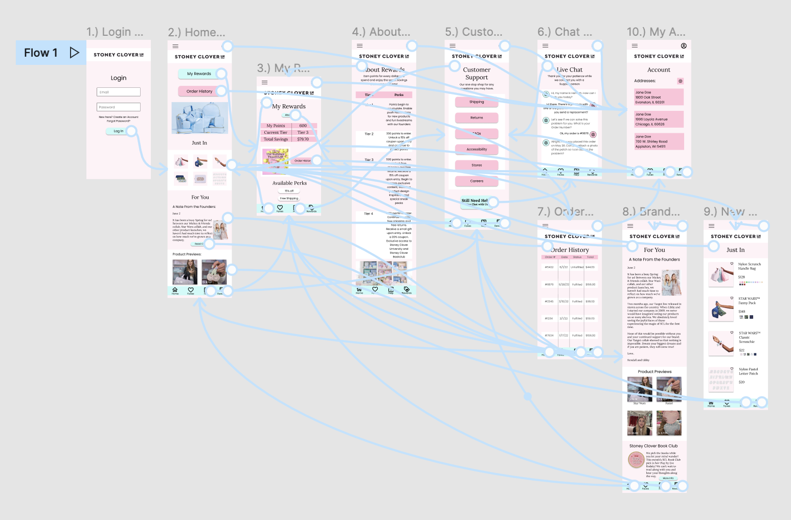
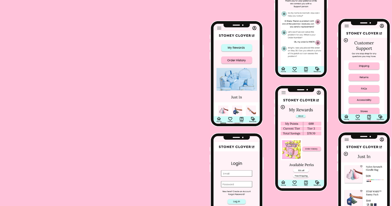
After taking into account feedback from users during my second Usability Study, I created my finalized high-fidelity prototype in Figma.
Final Mockups for Mobile
Next Steps
If working with a team rather than independently, I would add in a scroll bar to prompt users to scroll down. It would also be wise to evaluate whether the app should expand into a mobile Shopping App with integrated Customer Loyalty and Customer Support features.
Given that the majority of users surveyed during the initial research phase shop and browse via mobile device, a sleek and organized mobile shopping app (including the Customer Loyalty program I have laid out, as well as my Customer Support feature) would serve the brand well financially by improving usability and increasing user satisfaction.


